
March 13, 2019
The End of an Era
As you can see, the last post on this blog is from Feb of 2013. That's over 6 years ago. I moved over to Squarespace and was there for many years. Yesterday I let my site expire. 4 years ago, we had twins and our life was changed forever. I couldn't keep up with the custom invitations and I retired from the business 2 years ago. I loved working on custom invitations for the 10+ years I did it, but at this time, it's just not feasible. I would love to start offering digital, print-your-own invites, but that sort of work is still a ways away. So, this is farewell for the time being, but I'll be back someday in a new and exciting way!
February 2, 2013
Summer on the Cape
It's been awhile since I've gotten to do a local summer wedding. This year, I get two!
First up is the adorable bride, Brittany. She is on trend with fashion and very much a Cape Cod girl. Prep and style! Her wedding is at the gorgeous Wychmere Beach Club overlooking Nantucket Sound. I was thrilled when she told me that she wanted to do a modern nautical theme.

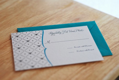
Her wedding colors are navy and green. Classic, but with the color green we chose, it adds a modern punch I'm thrilled with. Her venue needed to know what each guest was ordering for their entrée, but the venue offers such wonderful dishes, she didn't want to just say "chicken or beef." We needed a way to have a clean and simple response card without losing a ton of white space making it crowded. I came up with the perforated RSVP card. The bottom portion is the reply card and the top portion shows the menu items on the back as well as a site reminder on the front.


First up is the adorable bride, Brittany. She is on trend with fashion and very much a Cape Cod girl. Prep and style! Her wedding is at the gorgeous Wychmere Beach Club overlooking Nantucket Sound. I was thrilled when she told me that she wanted to do a modern nautical theme.


The bride wanted one thing more than anything else, a custom illustrated map. I am always up for a challenge and being a Bay Stater myself, I love the shape of Cape Cod. The coast line is a great one and needs showcasing! I illustrated the land and the major roadways, added cities and little icons here and there. I love how it came out and so does the bride! On the back we placed the written directions and because the front was so heavily illustrated, I wanted to keep the back clean and simplified.


These are, by far, my favorite custom invitations I have done to date! I am thrilled with how they came out and even more thrilled with the bride's response. I'll be working on other wedding paper goodness for Brittany so keep an eye out for those!
April 6, 2012
Monograms
Monograms are essentially the logos of Weddings. A monogram is a symbol used throughout the Wedding to represent the couple. You will usually see a monogram on the Wedding program, on the menu, seating chart and maybe even the thank you stationery.
It's something that isn't necessary, but makes the event even that more cohesive and special.
Here are a few examples of monograms I have created in the past, including my own!


It's something that isn't necessary, but makes the event even that more cohesive and special.
Here are a few examples of monograms I have created in the past, including my own!
March 19, 2012
I've had a secret obsession for the past few months and I'm sure a lot of you have shared in this obsession with me. Pinterest!

It's a fantastic site. I've used it to post my own designs, mark designs I can use for inspiration or product ideas, as well as pin what I want to do with my office, house, bathroom, etc.
It's a fantastic place to come up with, find and search for ideas for you Wedding, holiday, celebration or any other life event.
Please follow me!
Please follow me!
January 5, 2012
Golden Winter Wedding
Kim and BJ are having a beautiful winter wedding tomorrow. I can't think of a more fantastic way to start off the new year and every other new year following!
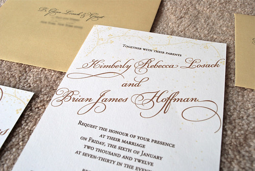
Kim's bouquets feature baby's breath as the main focal point and wanted the invitation to reflect this often understated flower. I wanted to make sure that the invitation reflected the winter season, so I had the petals fall off the branches as if they were snowing down over the words.

Kim wanted her wedding colors to be a part of the invitation as well. The gold tones come from warm firelight and the brown hues are inspired by the couple's love of a comforting cup of coffee. Knowing the influence of coffee on their theme, I made the font flow and the swashes extend like steam from a fresh cup. I enhanced this idea by placing the main copy on a diagonal to make it seem as if the words were rising from the paper.
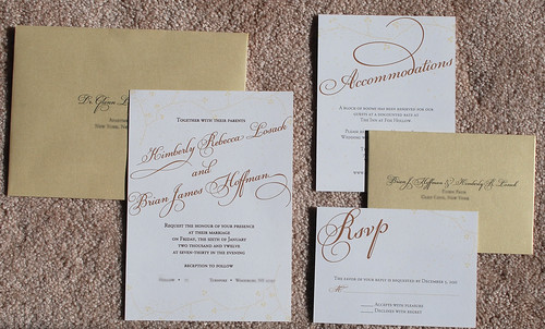
I wish Kim and BJ a lifetime of wedded bliss, health and happiness. Good luck tomorrow and congratulations!
Kim's bouquets feature baby's breath as the main focal point and wanted the invitation to reflect this often understated flower. I wanted to make sure that the invitation reflected the winter season, so I had the petals fall off the branches as if they were snowing down over the words.
Kim wanted her wedding colors to be a part of the invitation as well. The gold tones come from warm firelight and the brown hues are inspired by the couple's love of a comforting cup of coffee. Knowing the influence of coffee on their theme, I made the font flow and the swashes extend like steam from a fresh cup. I enhanced this idea by placing the main copy on a diagonal to make it seem as if the words were rising from the paper.
I wish Kim and BJ a lifetime of wedded bliss, health and happiness. Good luck tomorrow and congratulations!
December 26, 2011
The Creation of a Brand
An Inkling is a whisper of an idea. It's that little voice in the back of your mind telling you something big is going to happen, even if you're not sure what's coming your way. In the most literal sense, An Inkling is a drop of ink. For every special occasion or thought of a loved one, paper and ink are there. Wedding invitations are sent. Baby announcements are made. Thoughts of you are mailed. Notes are taken. Thanks are given. I love you is said.
While planning my wedding in 2005, I had a hard time finding good quality, modern and unique invitations. Frustrated, I took on the task of designing my own Wedding Stationery. Since I was trained in graphic design, my skill set transferred well and the invitations were a success. Friends and family loved what I had created and soon were asking for their own special occasion design and then their friends and family were asking for their own designs and so on. With every event I did, my love of this craft grew until I realized this is what I was meant to do and I truly love what I do.
Quite a few referrals later, my designs have been used in many celebrations and special moments. After being told time and again I should go into business, that's exactly what I have done.
I started dreaming of making a brand out of An Inkling back in 2006 when I was working on one of my first referrals. I made a logo that, at the time, suited my needs. I did very few sketches. I wanted it to be clean and modern with geometric lines, so I went with a pre-established font and added a simple "drop" to the dot of the "i."

In 2010, I realized that I had a logo, but not a brand. I refocused and realized I needed a logo that would match what An Inkling Design was all about. While I love working with geometric lines and modern fonts, that's not the message I wanted to convey with my logo. I spent more time sketching and took plenty of time exploring various looks. Finally I landed my current logo.
 It's reflective of what I would like my brand to represent. It's unique and an extension of myself because it's my own handwriting. In fact the drops under the "k" were actual drops the pen made while I was sketching. It's also versatile. I can adjust colors depending on the background. It works at large or smaller sizes and is expressive. In short, what I want all my work to be able to do.
In addition to redesigning my logo, I also redesigned my website, my blog and began exploring designs that worked well with the style I want to portray. In that first year of my refocusing my brand, I increased my sales and began to see more clients coming from other sources unrelated to prior clients. In 2011, I filed for and received my business license.
As for the future, I have large dreams and will continue making strides toward them.
While planning my wedding in 2005, I had a hard time finding good quality, modern and unique invitations. Frustrated, I took on the task of designing my own Wedding Stationery. Since I was trained in graphic design, my skill set transferred well and the invitations were a success. Friends and family loved what I had created and soon were asking for their own special occasion design and then their friends and family were asking for their own designs and so on. With every event I did, my love of this craft grew until I realized this is what I was meant to do and I truly love what I do.
Quite a few referrals later, my designs have been used in many celebrations and special moments. After being told time and again I should go into business, that's exactly what I have done.
I started dreaming of making a brand out of An Inkling back in 2006 when I was working on one of my first referrals. I made a logo that, at the time, suited my needs. I did very few sketches. I wanted it to be clean and modern with geometric lines, so I went with a pre-established font and added a simple "drop" to the dot of the "i."
In 2010, I realized that I had a logo, but not a brand. I refocused and realized I needed a logo that would match what An Inkling Design was all about. While I love working with geometric lines and modern fonts, that's not the message I wanted to convey with my logo. I spent more time sketching and took plenty of time exploring various looks. Finally I landed my current logo.
In addition to redesigning my logo, I also redesigned my website, my blog and began exploring designs that worked well with the style I want to portray. In that first year of my refocusing my brand, I increased my sales and began to see more clients coming from other sources unrelated to prior clients. In 2011, I filed for and received my business license.
As for the future, I have large dreams and will continue making strides toward them.
October 8, 2011
Liz's Boston Elegance
Living in New England, there are a lot of Autumn themed weddings come September. I should know, mine was one such wedding. Liz, however, wanted a truly classic, refined invitation with Boston elegance that would astound during any season.
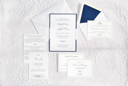
The colors for the wedding were navy and ivory and with such gorgeous colors, it was easy to stay elegant and refined. We wanted the invitation to be traditional, but not boring. I added a satin ribbon accent and backed each card to give it extra dimension.
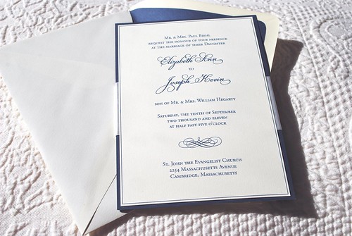
With the incorporation of the ribbon, I was able to turn a traditional accent into a modern utility. Instead of hiding the ribbon behind the card backing, I allowed it to remain visible and act as a folder, holding the additional inserts. There was no risk of an insert going unread or thrown away because it was accidentally left in the envelope. All the inserts were held onto the back of the invitation itself.
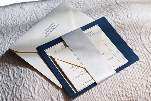
Liz's invitation suite set the tone for the wedding. From the moment her guests received these beautiful invitations, they knew they were attending an elegant wedding. An invitation should match the tone and theme of the wedding, guests not only appreciate that, they will compliment the bride on her thoughtfulness for years to come. Liz definitely hit the nail right on the head with this style and I hope she and her guests love these invitations as much as I do.
The colors for the wedding were navy and ivory and with such gorgeous colors, it was easy to stay elegant and refined. We wanted the invitation to be traditional, but not boring. I added a satin ribbon accent and backed each card to give it extra dimension.
With the incorporation of the ribbon, I was able to turn a traditional accent into a modern utility. Instead of hiding the ribbon behind the card backing, I allowed it to remain visible and act as a folder, holding the additional inserts. There was no risk of an insert going unread or thrown away because it was accidentally left in the envelope. All the inserts were held onto the back of the invitation itself.
Liz's invitation suite set the tone for the wedding. From the moment her guests received these beautiful invitations, they knew they were attending an elegant wedding. An invitation should match the tone and theme of the wedding, guests not only appreciate that, they will compliment the bride on her thoughtfulness for years to come. Liz definitely hit the nail right on the head with this style and I hope she and her guests love these invitations as much as I do.
June 27, 2011
Minted Design Challenge
I have always wanted to enter a Minted Design Challenge and just haven't gotten around to it. Until today!
I finally had a contest that I had a great idea for (inspired by my recently expecting friends) and time to flesh out the concept. My friends are expecting a baby and want to be surprised by the gender at the birth. Naturally their colors are yellow and her Nursery is going to be Pooh themed. Pooh is obviously a very heavily trademarked Disney property, so I went with the bumble bee from all of Pooh's lovely honey pots.
I wanted to keep the design simple, to show of the real reason why the parents are sending out this invite in the first place! Add a stripy background for a little extra oomph and a birth announcement was born.
If you like it, click on the link below and vote for me!
Vote for my design on minted.™ see more from Sarah Pellegrini vote for me!Check out my competition in Christmas cards and wedding invitations at Minted. |
June 7, 2011

June 1, 2011
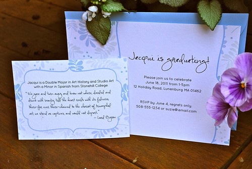
Jacqui's Graduation
Jacqui is graduating from college and her family wanted to throw a party. Jacqui wanted a soft color scheme and decided on light blue and greens. Inspired by that color palette, I went with a light floral and leaf pattern.
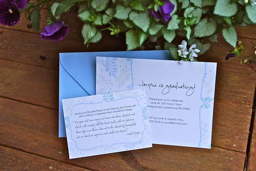
While studying art, Jacqui came upon a piece written by Lord Byron that meant something special to her. We included this quote as well as her college majors on the insert.
While studying art, Jacqui came upon a piece written by Lord Byron that meant something special to her. We included this quote as well as her college majors on the insert.
We gaze and turn away, and know not where, dazzled and drunk with beauty, till the heart reels with its fulness; there-for ever there-chained to the chariot of triumphal art, we stand as captives, and would not depart.
– Lord Byron
May 29, 2011
When life gives you lemons, make lemonade!
Every once and awhile a client and I will meet and talk about a ton of different ideas, so many ideas that we try a few of them out before finding exactly what they're looking for. This is a concept that came out of a meeting with a client who chose another idea instead.
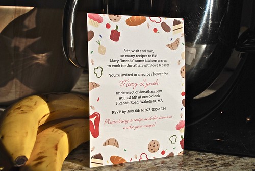
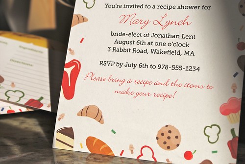
The concept of this invitation was "Sweet & Savory." The bride is having a recipe shower because she already has a lot of cooking and baking equipment, so she didn't want her guests to spend money on unnecessary gifts. This would have one recipe card featuring sweet items and another recipe card featuring savory items.
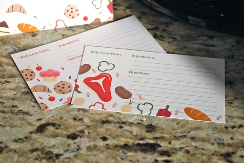
On the invitation, we combined both the sweet and savory foods into a frame around the invitation information. This concept didn't end up working for the bride, but we came up with another idea that was more for her. I'll be posting that design at another time, so keep an eye out!
This goes to show that not everything that gets created works out, but just because it didn't work for one person, doesn't mean it won't work for someone else! I think this turned out really well and I will be including it in my Etsy shop once that opens, hopefully this Fall!
The concept of this invitation was "Sweet & Savory." The bride is having a recipe shower because she already has a lot of cooking and baking equipment, so she didn't want her guests to spend money on unnecessary gifts. This would have one recipe card featuring sweet items and another recipe card featuring savory items.
On the invitation, we combined both the sweet and savory foods into a frame around the invitation information. This concept didn't end up working for the bride, but we came up with another idea that was more for her. I'll be posting that design at another time, so keep an eye out!
This goes to show that not everything that gets created works out, but just because it didn't work for one person, doesn't mean it won't work for someone else! I think this turned out really well and I will be including it in my Etsy shop once that opens, hopefully this Fall!
May 24, 2011
Owl Nursery Pillow
As you may have seen in my previous post, I got to work with a really cute owl fabric! It was for another pillow! You may recall my first attempt at making a pillow went surprisingly well. They say that practice makes perfect and it's true because this one came out even better.
Lauren became a new mom this month! She had fantastic curtains made from the owl fabric for the nursery. She had JUST enough left over to make something with. She asked if there was enough for a pillow and I jumped at the chance to make it. I had so much fun the last time and this is just such cute fabric I had to make this pillow.
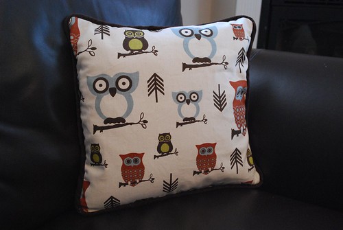
I made the cording from brown corduroy and set it at an angle. I was very happy with how it looked. I sewed the panels together and added a zipper so you can remove the insert to clean the case. When something is made for a baby or child, it's very important to make it washable.
I hope to have additional photos of the pillow in the nursery very soon and will add those when I get them.
I believe this will be it on the sewing for a little while. I have a lot of design work coming in that I'm really excited about and will be sharing a couple of projects with you in the next two weeks. Check back soon!
Lauren became a new mom this month! She had fantastic curtains made from the owl fabric for the nursery. She had JUST enough left over to make something with. She asked if there was enough for a pillow and I jumped at the chance to make it. I had so much fun the last time and this is just such cute fabric I had to make this pillow.
I made the cording from brown corduroy and set it at an angle. I was very happy with how it looked. I sewed the panels together and added a zipper so you can remove the insert to clean the case. When something is made for a baby or child, it's very important to make it washable.
I hope to have additional photos of the pillow in the nursery very soon and will add those when I get them.
I believe this will be it on the sewing for a little while. I have a lot of design work coming in that I'm really excited about and will be sharing a couple of projects with you in the next two weeks. Check back soon!
May 16, 2011
May Update!
This month has by far been my busiest! I have four projects all happening at once and that doesn't include any of the personal projects I've been working on.
I will be able to share two of these projects with you very soon, so stay tuned!
For now, here's a sneak peak at some cute fabric I got to work with...

I will be able to share two of these projects with you very soon, so stay tuned!
For now, here's a sneak peak at some cute fabric I got to work with...

April 22, 2011
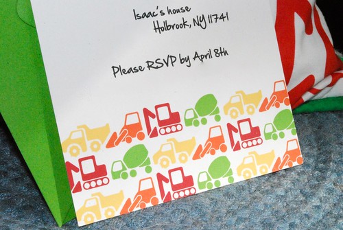
Isaac's Construction Birthday Party Invitation
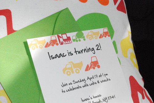
Isaac turned 2 last week and to celebrate, he had a construction themed birthday party! Isaac may only be 2, but he knows every type of construction vehicle in creation. He even knows what an excavator is! Well, it was only appropriate to make brightly colored construction vehicles to put onto the invitation as a pattern. Four of his favorite trucks appear in the pattern, a mixer, crane, bulldozer and dump truck. I illustrated them in a very simplified way using basic shapes because I wanted each element to be recognizable as a construction vehicle, but together work as a pattern. If a pattern works out well, it can be used for almost anything!
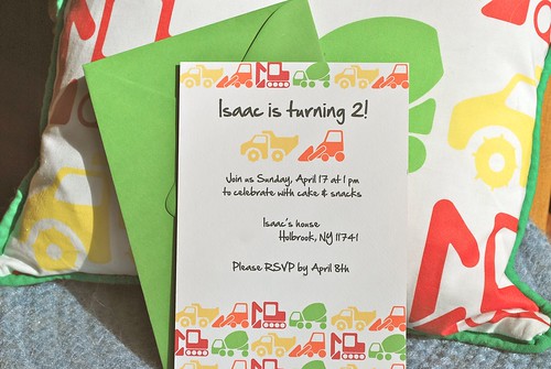
I was so pleased with how the truck pattern turned out that I had it printed on fabric! Childrens' patterns are perfect to print onto fabric and I decided that I wanted to try making a pillow. I had just learned how to use a sewing machine in October and I was nervous about getting ahead of my sewing skills with this project.
I didn't want to make a pillow with stuffing because that wouldn't be easy to clean. When making things for children, the most important thing to remember is that it will need to be washed. For this project, that meant getting a pillow insert and making a slipcover with a zipper. I wanted to add cording because I thought it would look nice. A few youtube vides later, some sewing, ripping and resewing later, and I had a pillow I was proud of.
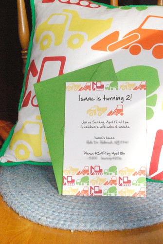
The pillow matches the invitation perfectly! I made this pillow as a gift for Isaac, but fabric can be used for plenty of other things party related! It can be used to make a table cloth, flag banners or even use it as ribbon for gifts. I'm excited that this fabric test worked out so well. I will be experimenting with fabric in the future and hope to have more projects to show!
If you would like to purchase the construction vehicle fabric, it's available for sale on Spoonflower!
April 9, 2011
Sneak Peek!
I had so much fun with this invitation that I couldn't wait to share. Just a quick photo for now, a full write up will be coming soon!
March 29, 2011
World Collection: Fleur-de-lis
Fleur-de-lis is French for "lily flower." When many people see this symbol, they assume it is the symbol of France. Ironically, it is not associated with any French republics. It has appeared on postage stamps in France and it is associated with people of French origins though. It is currently seen on the Arms of the King of Spain and the Grand Duke of Luxembourg. It is associated with French settlements, such as Quebec, St. Louis and Louisiana. So, while it's inherent nature is certainly French, the fleur-de-lis can be seen in many other countries which makes this truly a world symbol.
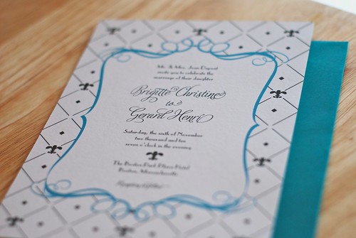
The fleur-de-lis is instantly recognizable and therefore has been reproduced countless times in as many different styles as there are artists. For my interpretation, I wanted the shape to be rounded and soft. I want this symbol to appear inviting and supportive of the main content, not to be the main focal point. I used the ornate, brightly colored frame to draw the eye to the copy, which is always the most important part of any invitation.
The shape of the frame is very interesting and I wanted to use it in a new way for the save-the-date. I used only a portion of it and framed the pattern, while using the shape of the frame again to draw the eye to the content. I wanted to keep the script font classic, but the copy font has a Parisian feel to it which goes very well with the fleur-de-lis theme. Like all the previous World Collection sets, this works well not only as an invitation, but also personalized stationery.
All of the World Collection sets will be available for purchase soon. Stay tuned!
Subscribe to:
Posts (Atom)